
Fleshed-Out Frida Kahlo Exhibit Branding
- Mary Louise Boylston
- Apr 23, 2023
- 3 min read
Updated: Apr 23, 2023
Getting peer critiques and revisiting the research that started this project was important in further developing this branding. It allowed for a better understanding of the subject matter and the feedback from peers provided perspective that is easily lost in the tunnel vision of a project. A more dynamic pattern, a powerful logo, and a reworking of the promotional materials creates a more comprehensive branding packet.
The museum itself is in Coyoacàn, which is in Mexico City. What sets it apart from other artists museums, like the Van Gogh museum in Amsterdam, is that the property itself is where Frida lived most of her life.

Pictured here is one of the few images that exist of Frida within Casa Azul. An oasis of plants and a home for her pet spider monkeys, this was an exception property for an exceptional woman.

Her life was marked with severe tragedy and hardship, so her persistence in creating and expressing herself through art is remarkable. A bus accident changed her life forever when she was 18 years old, and she was impaled by an iron handrail that went through her pelvis. She suffered a lifetime of physical ailments afterwards. Sustaining an injury to that degree is hard to imagine but she did not let it dull her spark and she continued making art basically until she died.
Pictured here are some photos that speak volumes about her character:
An apparatus allows her to paint while she is basically immobilized from her injury in this image.

Then, we see her with one of her iconic hairpieces, still restricted to the bed, but with a body cast that’s covered in her own paintings—this cast is on display at the museum and it’s hard to tell in this picture, but the chest piece displays the communist hammer and sickle symbol. She and her husband at the time (Diego Rivera) were supporters of the Mexican Communist Party.

And lastly, we see her a year before her death and what strikes me about this picture is that she's in a hospital bed, clearly very fragile at this point, with a nurse at her bedside, and she’s smoking a cigarette. Times were certainly different in terms of cigarettes not being very taboo yet in the 1950s, but it's still a potent image.

Her art is expressive of her life, and she did not protect her viewers from any harsh realities that she experienced. Trouble with fertility, lifelong physical injuries from the accident, identity exploration, and emotional struggles through her young marriage and then later divorce are concepts that translate through her paintings. The following 4 images are Frida Kahlo's work.


Viva la Vida, Watermelons, was the last painting she created and the final touches were done only a few days before she died in 1954.

With that research in my back pocket, it was time to revisit the branding for the exhibit at Museo Frida Kahlo.
The Explorer archetype influenced this work, and they are an ambitious and inspired mindset, with restlessness and flakiness as the bane of their existence. Every day is an opportunity for the explorer and boredom is not an option. There is a sense of community around fellow explorers, but it’s a primarily independent lifestyle.
Here are some initial logo explorations...

Developing further one of the sketches that included both typography and imagery allowed for playfulness in color and form. The rest of the assets easily fell into place once the tone was set with this logo mark.


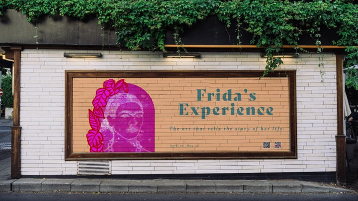
Using monotype prints from my own workspace, I created marketing materials in the form of posters (that can also be postcards), mural ads, and for digital marking like banner ads on other websites.
Original monotype:

Ghost print #1:

Ghost print #2:

Back to the branding & marketing!


Comments